Close

CRI WALL MURAL

Painted drywall has never looked this good...

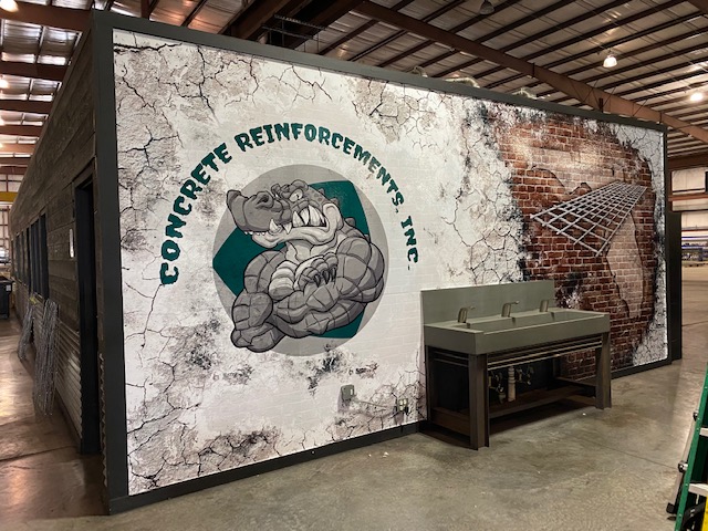
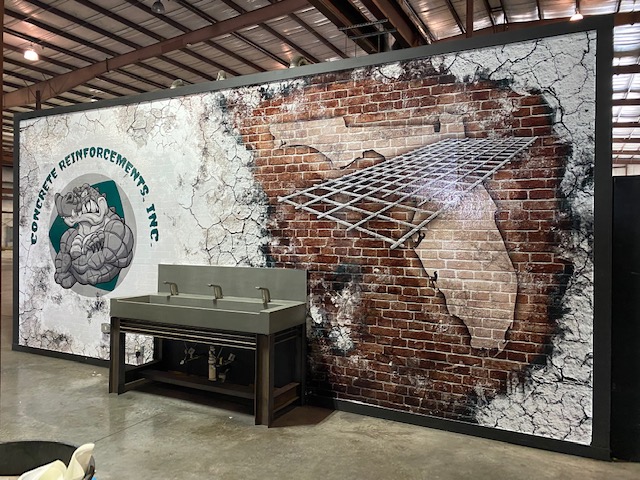
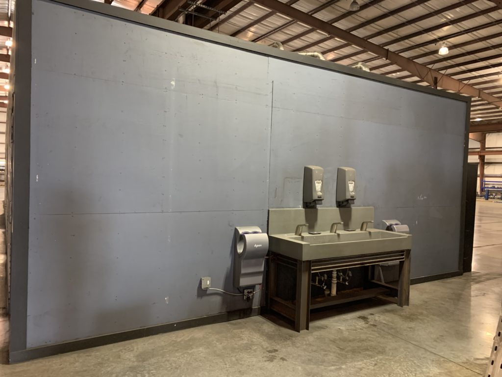
CRI (Concrete Reinforcements, Inc.) felt that the wash station in their Jacksonville, FL location was in need of some graphics to make the painted drywall look more interesting and engaging for everyone who used it.


I have worked with them before so they trust my style and designs.


They contacted me, explained the idea they had in mind, then told me to run with. 

DRESSING UP A GATOR

Hint: they like it rough...
PROJECT DETAILS

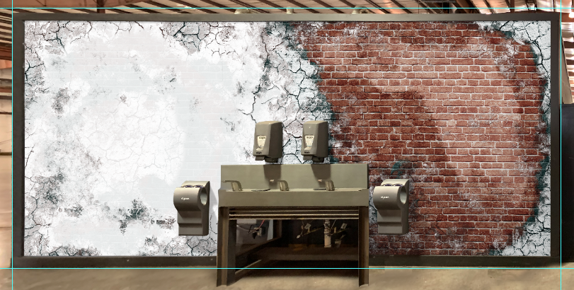
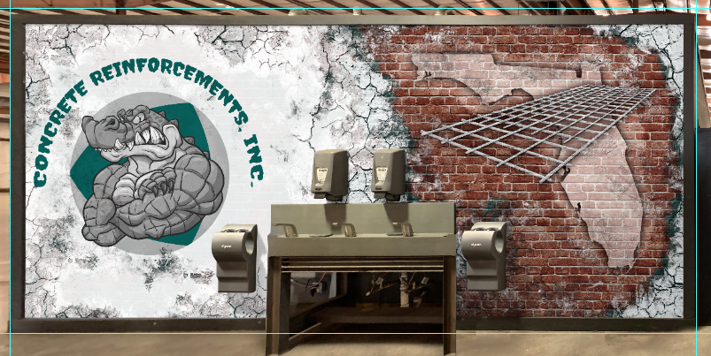
CRI approached me and wanted me to design a wall mural that looked like brick showing through some aged, eroded, grungy paint. Graphics on both the painted and eroded brick sections, similar to an older building that has been painted over a few times, need to be included and match the distressed look.


This facility is in Jacksonville, FL  and has a special logo with a stylized alligator that needs to be used for this location.


The design on the exposed brick section needs to be an outline of the state of Florida with a grid/mesh of rebar over the top of it but having depth and perspective, kind of like it’s coming out of the wall.


The entire mural needs to be designed in a way so none of the main graphics are obscured by the wash station, hand dryers or soap dispensers.

PROCESS

FIRST THINGS FIRST

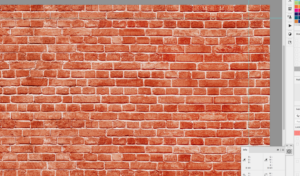
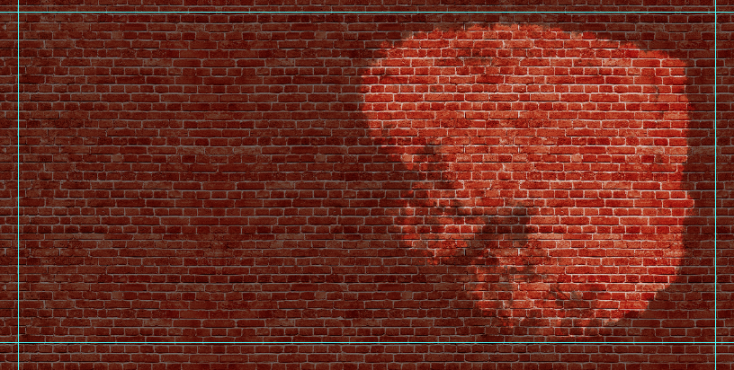
The wall measured 257″w x 115″h. Based on these measurements I built the template of the wall first, then sourced the highest resolution brick photo I could find and built a brick pattern that covered the whole wall. 


Additionally, I used individual brick sections to minimize the wall from looking too much like a repeated pattern. This was done in Photoshop taking into account grout, color and shape. 


ANOTHER BRICK IN THE WALL

Make the drywall look like old, painted bricks...

GRUNGE

Minus the flannel and Doc Martens...

GRUNGE FX

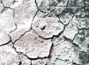
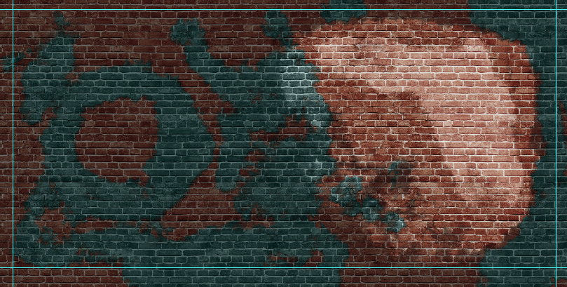
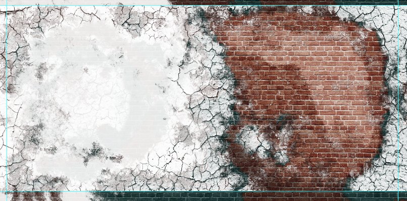
The grunge effects are a combination of textures, brushes, blending effects, adjustment layers and styles built up on top of each other. 

I started with a photo of dried mud for the cracked textures on the edges of the paint, making selections and applying masks to multiple layers, adding drop shadows and bevels. Building up from there, I added additional textures and used special brushes along the edges to get the weathered, aged look.

HACKING THE GRID

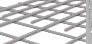
The rebar mesh ‘grid’ was something I was going to have to digitally create to get the perspective and resolution needed. I designed the mesh in Illustrator to take advantage of vector scalability and manipulate the element as needed to fit the overall design.

OFF THE GRID

Not all grids are created equal...

FINAL TOUCHES

Ghosting Florida

ALL GUSSIED UP

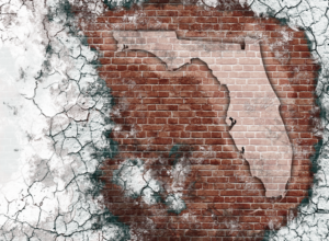
Florida needed to be identifiable but not overwhelming. I have a vector map of the United States so I pulled Florida out of the map, changed the color to white in Illustrator and placed it into Photoshop. From there, I was able to apply blend modes and layer styles to get it looking like it was painted on the brick.


The mesh grid also received some heavy effects to get it to sit in the mix, so to speak. 


Finally, overall color adjustments and some trickiness with masks and brushes were made and built up on each layer to help with the illusion.

RESULTS

From the pictures I can see that the design looks great. The owner sent me an email letting me know he was really happy with the design and the way it turned out. It hit all the checks on the list: the grungy, distressed look of old bricks that have been painted over several times with graphics that represent both the company, the location and what they specialize in, which is rebar mesh concrete reinforcements.

That’s beyond amazing ! You’re an artist ! Thank you boss