Close

HARRY LUGE JR

SOMETHING REAL

Harry Luge Jr has let me work with him on a number of projects. From his electronic press kit to social media and vehicle graphics, he has trusted me with his visual identity for the past few years.


When he asked me to do an album cover for him I was more than willing to design the art for it.


HONKY TONK

Rustic and traditional.

PROJECT DETAILS

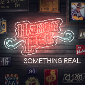
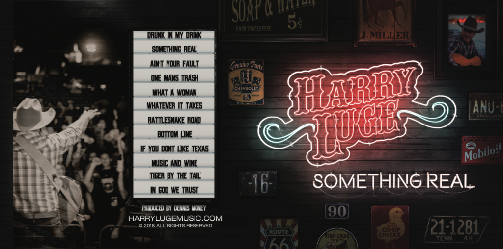
The album cover started out with only the front, since the album was originally only slated to be a digital release.  Harry was wanting a look similar to what you would see on the walls of an old Honky Tonk bar in Nashville: old signs, reclaimed wood, maybe a neon sign or two.


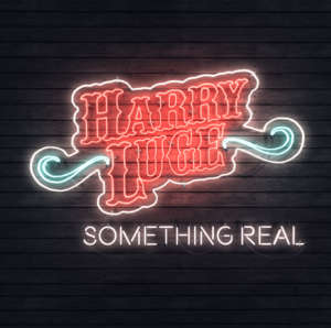
We came up with a design that would allow for the album cover to work as both a still image and animated, since he wanted to try to get it onto Spotify using a new animation feature that loops while songs play. The idea was to have his name and the album name be neon signs on the wall, that would flicker and turn on and off, like old neon signs.


I have to admit I do not frequent bars, listen to much country music and have never been to Nashville, so this was really exciting for me and I could not wait to get started.

PROCESS

FIRST THINGS FIRST

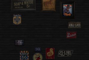
I used to work in a salvage yard that had a metric ton of old stuff tucked away all over the place. I hit up the owner and let him know what I was working on and he said to come on over. Most of what he had was old car parts and rusty signs of gas stations so it worked out pretty good. But I found an old license plate from Tennessee and that really tied everything together. 


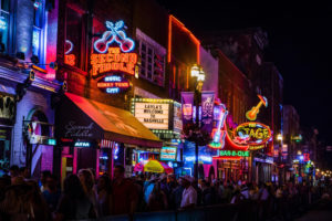
Thanks to google maps I was able to virtually explore Nashville’s famous Broadway street and see what these bars look like on the inside. With the research complete it was time to build the neon signs and get everything together.

NASHVILLE LOOKS GOOD ON YOU

Peace, love, and the land of country music.

NEON DREAMS

Neon, Neon, everywhere

IT'S A GAS

Building the neon signs was a bit more tricky than finding old things to take pictures of. The glow and lighting effect was fine but I was struggling with the lighting and making it look real.


I decided to build the neon signs in After Effects so I could create lighting effects in a 3D space. Each element could have it’s own layer and be able to cast shadows and reflect light in a more natural way.


I found a 3D rendered collection of parts that had clips, caps and wires made for use in After Effects that would add an even deeper level of realism. The collection also included additional glow effects to help with neon signs.

WOULD I? WOOD EYE!

The wood panel background was designed in Photoshop. Color adjustments were made to keep the wood dark enough to absorb the right amount of light without reflecting too much and washing out the glowing neon effect. 


The different wall items were added as 3D layers in After Effects so they could accept some of the lighting effects from the neon. 

OFF THE WALL

Gotta straighten up your act and boogie down.

FLICK THE SWITCH

Your name in lights.

I'M IN A SOUTHERN STATE OF MIND.

The elements were placed around the center of the wood paneling to create a space large enough for the neon signs to fit and look natural. 


The next part was challenging to get the amount of lighting right. It was mostly just trial and error and balancing how much light the neon gave off in relation to how much the other signage was reflecting. 


Once I got this dialed in it was time to make global color adjustments and start animating.

BABY GOT BACK

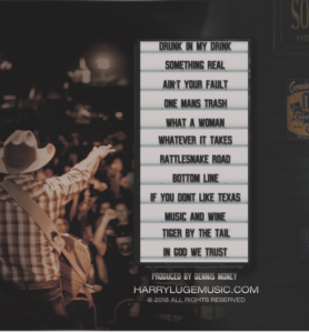
After I got everything adjusted and animated (which looks cool by the way) Harry contacted me and said that they decided to release some physical copies of the new album for sale at his live events. They were only doing the ECO wallet style, which is essentially a cardboard envelope, but it was going to need to have the back designed. 


The info on the back was simple: song names, producer credits, website and room for the bar code. The design for the back was up to me, but Harry did want it the back to tie into the front. 


In my research of the Nashville bar honky tonk bar scene I found that many of them have marquees. A marquee would fit the overall look of the CD cover and be an easy way to showcase the names of the songs. I also found a font that looked like marquee letter tiles which all helped to make the marquee look convincing for the back panel.


Additionally, I decided to have the part of the front design continue and almost wrap around to the back to create a sense of continuity.

FRONT TO BACK

Does the jewel case make my butt look big?

RESULTS

We decided to add a vignette to the neon sign section to help it stand out more and create contrast. The album cover, both front and back, would not be out of place in or out of the various clubs that line Lower Broadway in downtown Nashville. 


From the vintage signage adorning the wood paneled walls to the glow of neon, the design nods to the traditional, honky tonk, country music scene of Nashville.  There is little doubt when looking at this design what kind of music is on this CD.

- Absolutely LOVE IT!!!!