Close

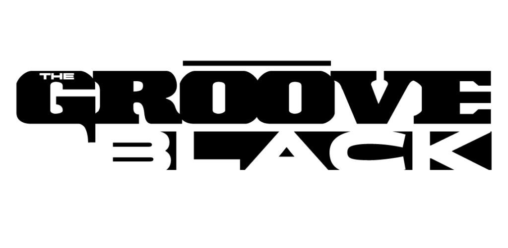
THE GROOVE BLACK

LOGO & ALBUM COVER DESIGN

The Groove Black is an alternative Americana style rock band from Sandpoint Idaho.


The band is wanting a modern looking logo that matches their slightly edgy sound but still rooted the free spirit, bohemian and passively rebellious nature that surrounds their northern Idaho town roughly 40 miles south of the Canadian border.

HMMM.....

The old logo was no longer working for them...
PROJECT DETAILS

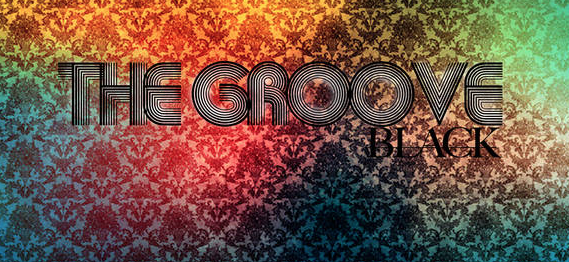
During the discovery phase the band expressed that the old logo was no longer working for them; it did not encompass the modern rebel attitude and was not playing off of their home-town vibe and sound. 


I suggested that the use of text could be more effective if it had more contrast in style. We could design a word mark and have the two main words display different font styles for visual contrast.  I also felt it would allow for more flexibility. 


They also mentioned wanting to get started on the art for their new album and asked if I would be willing to design that too. I was thrilled with the possibilities and agreed, especially because I enjoy doing album covers.

PROCESS

FIRST THINGS FIRST

Before I could get started on anything I needed to design the new logo for the band.


I started sketching ideas and I noticed that the different text/font styles I was using seemed to fight with each other. The typography was not connecting and I wasn’t sure if the idea was going to work. The sneaky ‘self doubt’ phase that can happen is such a pain in the neck.


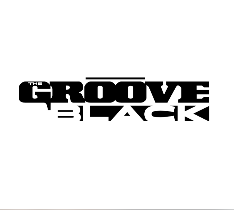
Recognizing that I simply needed a break, I came to the design a few hours later and started stacking the words, rearranging text, using negative space, trying monograms–anything to push the design forward. That got me in the flow and ended up with something I felt I could present to the band. 

TUNING IN

I just need to adjust the antenna...

ON THE RADIO

Old radios don't die, they just lose reception...

DIALING IN THE STATION

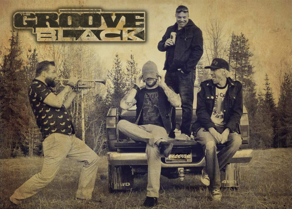
During the logo refinement they began to send me images of the latest photo shoot they did for promoting the upcoming album release. This gave me a better idea of where I could take this. 


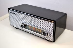
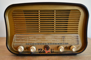
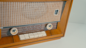
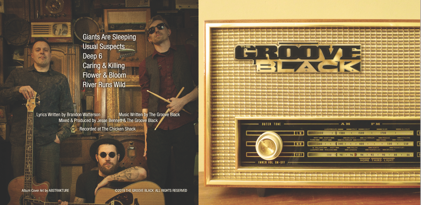
The image that really stuck out to me was the band members surrounded by antiques of old radios. I decided to take their newly designed logo, make a sort of badge out of it, and place it on the corner of the radio, like brand identification. 


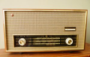
I wanted a close up, straight on, high resolution image of a vintage radio and began searching the internet to get some ideas. 

A FACE FOR RADIO

The radio image I sourced for the album cover was something I found online when I was researching old vintage radios. It actually resembled one of the radios from the photoshoot of the band that inspired the idea to use a radio in the first place.


Some perspective warping in Photoshop got it perfectly straight from the front and I was able to hide the original manufacturers badge with some clever clone stamping on the fabric mesh.

TWIST THAT DIAL

Turn on. Tune in.

A BADGE OF THEIR OWN

Adding a new logo to an old radio...

AMPLITUDE OR FREQUENCY

The radio was ready to get badged. I had to make the logo look like a manufacturer badge that you would see on vintage radios, along with the patina and aged look of plastic gold chrome to match the look and feel of the radio.


I created multiple layers in Photoshop to build the patina for the gold chrome. Gradient layers, grunge brushes and bevels were added to create depth. I also added some screws and drop shadows for a little more realism.

Once the badge was finished and placed on the radio grill I made some color corrections and started to focus on the back of the CD.


Fortunately, they wanted to use the image that had inspired me to create the radio design. I simply added the song titles and credits right down the center, and placed a subtle dark brown vignette over the back to draw some attention to the song tracks in a subtle way. The photo was actually perfect for the back, the way everyone was sitting and the space left in the middle was almost deliberate, like they knew that I was going to need some space for the credits… 

RESULTS

The CD cover was approved and finalized for print with only minor revisions to the text. The logo badging on the radio grill cloth looks vintage and authentic. The band was able to release their new album on iTunes, Spotify, and Amazon Music, as well as Bandcamp. They also had physical copies made for sale at their live events.


By the way, I love it when bands send me a physical copy of the finished CD, and these guys actually sent me 2! I framed one of them. 


Overall the entire project was a success for both the band and myself, because they have asked me to do a few more projects for them, including some Instagram promo blasts. you can check those out on the portfolio page.

LOVE it bro! Lets go with it!